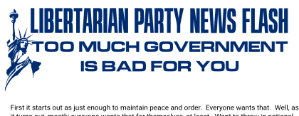
For Wordmarks, Logos, headlines, and titles, Microgramma is recommended. Extended width should be used by default, but switch to narrower width Microgramma/Eurostile/Libertygramma fonts as your use cases may require or at least call out for. The supplied Libertygramma fonts in this kit supply six widths, although only the Extended width font has reliable kerning as of this edition. This should be better soon.

If you want a different typeface for a certain use case, please be sure to use your choice consistently. TeX Gyre Schola aka Century Scoolbook is the fonts to use if you want a serifed typeface. If you want to match the headlines of post-2015 LNC-produced materials you can use Fontourist Journal, just be sure to send in a donation for it.
For body text, decide if you want serif or sans serif.
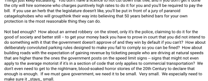
The most common choice for body text is sans serif, therefore Roboto 2014. Its lack of visual interest makes it a good choice for when the only thing you want the reader paying attention to is the words themselves and already hve their attention. It has a nice selection of weights, plus condensed fonts and even a set of monospaced fonts. Just be careful to avoid using Roboto 2012 by accident if you're grabbing it from elsewhere. With the same name, same designer, and the same company, how could anyone possibly get confused? It's a closely related typeface, but not the same, with important key differences.
If you're not using Century/Schola for a headline and title typeface, please feel free to use it for your main body of text instead if you prefer a serif body text for your use case. For a wider variety of weights and widths you may need to buy a licence for a commerical implementation, however.
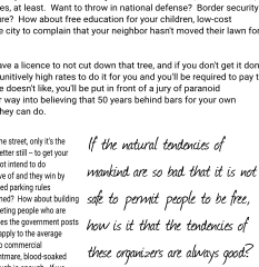
One good use of Journal is for asides of quoted text and other decorative flourishes.
Return to Main Menu