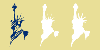
The main images of the Classical Statue Logo in this resource kit include three compotents: the main logo in blue, a white fill, and a white outline.

For white backgrounds, only the main logo itself is needed. Please keep the color at 288C or the best available spot color approximation. For strictly black and white usage, the logo should be solid black, not a halftone of black.
For printing on white T-shirts and the like, it is for most cases necessary to remove the white fill and background to avoid printing white on white, which does not normally work well.
For printing on white T-shirts and the like, it is for most cases necessary to remove the white fill and background to avoid printing white on white, which does not normally work well.

For light colored backgrounds such as gold or yellow, you may optionally remove the white outline and just have the fill.

For medium to dark barkgrounds, the white outline is needed. As the fill won't appear, you may optionally remove it. If your use case requires a thicker outline, please thicken it, such as giving it a write outline or offsetting outward.


Never invert the logo colors. Never substitue 640C or other not-dark-blue colors for the logo for normal usage. Only change the color for special cases or when more suitable colors are completely unavailable. An example of a suitable special case is to use purple (255C) with the LGBTQ flag.

You may crop the Classical Statue Logo as necessary. Whenever practical, please include the arm and torch. In a serious pinch, even just the face can be recognizable. Be sure to include her entire head or at least face.
Never exclude her face.
Never exclude her face.
The arm outline version is meant for places where the arm needs to be made clearer, as can be the case with local party logos.

For areas full of people who confuse the Classical Statue Logo for a symbol of New York City -- or worse, one of the government (everything about it was privately funded, including the mid-1980s restoration), try the hat variant.